Well this is a project from a while back, and I’ve wanted to
post it for a while, but I knew I’d need a chunk of time to write about it so I
put it off! It’s one of my favorite things we’ve done in our home because it
made it more ‘personal’ for me J
For the most part of a year we had no photos (other than art) up on our walls,
so finally we have a gallery wall!
This was a big project for me because it had to be perfect.
When you put holes in the wall it’s not something you can just take down or
move the next day if you don’t like it. I probably overdid it with the research
and analysis of what I wanted, but now in the end it’s something I love and so
I am happy.
If you’re thinking of doing something similar here’s how I
did it*:
1.
Design the Wall
~Get some ideas in your mind for the following questions:
-how big is the space you want to place your frames?
-How many photos do you have that you want to display?
-What type of look are you hoping for? (Symmetrical? Random?
Etc.)
~Search the web for some inspiration of layout, but don’t feel
that you have to nail down (pun intendedJ)
any certain look just yet (that’s what I did and it was too stressful!). Unless
you do find one that you love right away, then you’re golden.
~Decide which photos you want to display and their ideal
sizes. This will give you a quantity of frames to work with and help you more
with the layout.
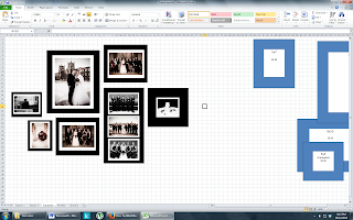
 ~In order to finalize my layout I took the tip from the blog
I read and made up an excel spreadsheet with rectangles and dimensions to scale
to make a mini version. This made is so much easier to play around with
different size frames and layouts with the click of a mouse! (Originally I
tried the ‘paper frames’ on the wall trials, but that didn’t work for me).
~Choose your frames. I shopped around. . . a lot. I looked at Michaels, Superstore,
Walmart, Ikea, and more. Knowing I wanted frames of the same design, just in
different sizes made it easiest to buy at Ikea for simplicities sake. Plus our
place is furnished by Ikea so it seemed only natural in the end!
2.
Hang the Photos
 ~Hanging the photos is not my thing so that’s where Deniss
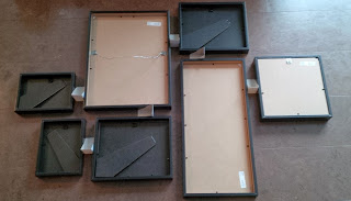
comes in! I laid out the frames on the floor accordingly (Tip: use the Ikea
corner bumpers as spacers so you don’t have to measure manually!).
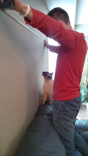
~Deniss measured the centre of the wall for placement, hung
the first frame accordingly and then it was dominoes from there with the
spacers to tell where each frame went.
~In order to physically hang the frames he created a little
tool (with the resources we had) to assist: a wooden spoon and a nail. Ideally
if you plan ahead you’ll get a paint stir stick. This is so you can easily hang
the frame off the nail on stick and when you place it where you want the nail
creates a small mark on the wall so that you can remove the frame and place the
nail for the frame**.
3.
Enjoy your work!
~I have to say my favorite part about the wall is the shadow
box. I saw the idea on Pinterest to frame your invitation so I took it one step
further to include the program, a dried rose from my bouquet, and some playing
cards! LOVE IT! How have/would you display these items (if at all)?
*During my
research process I found this blogger who provides great detail in how she did
it here (searching the RIBBA ikea frames is how I found it on Google
**see the tip in action here.


0 comments:
Post a Comment